Coronavirus (Covid-19): More Scary than Dangerous?
Assessing the impact of Coronavirus (Covid-19) on Total Deaths
- Problem :
- At the cusp of reported US Coronavirus deaths hitting the 100,000 mark (27 Mary 2020), it would be wise for us to step back a bit and review how dangerous this virus really is. We have a media environment with hidden agendas, conflicting accounts of Covid-19 death numbers, and varied cause of deaths (COD) attributions.
- What is the actual impact of Covid-19 on the total deaths numbers? Is the Coronavirus more scary than dangerous?
- Solution :
- One method is to analyse and compare the deaths due to All Causes over the same period of months, and contextualize over a number of years.
Data from US Center for Disease Control (CDC)
The country where the total deaths data over multiple years is most easily accessible is the US. The US CDC publishes this data over at the “Pneumonia and Influenza Mortality Surveillance from the National Center for Health Statistics Mortality Surveillance System” site (https://gis.cdc.gov/grasp/fluview/mortality.html)At the time of this writing, Week 18 (starting 27 Apr 2020) is the latest week for 2020 where complete data is available. From this Database, the All Causes Deaths numbers can be viewed graphically thus:
 |
| Weekly All Causes Deaths (US CDC) |
Analysis of Data
The interesting data points are Week 15 and Week 18 – which have 73.5k and 55.5k respectively. This clearly indicates that the peak deaths occurred at Week 15 and has been trending down since.
While the number 75.5k is a historical peak for any particular week, it is more useful to look at the overall numbers for the season, and how this compares with other years.
This is enlightening. We now see that:
While the number 75.5k is a historical peak for any particular week, it is more useful to look at the overall numbers for the season, and how this compares with other years.
 |
| Table 1 |
The 2019-2020 season shows a peak for number of deaths. This might indicate that Coronavirus is primarily responsible for this peak. To give a better picture it is useful to see if this is out of the ordinary compared to other years.
Seasonal Year-on-Year Comparisons
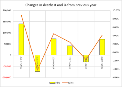
View graphically as: |
| Changes in deaths # an % from previous year |
- the largest year-on-year increase is from 2014 to 2015 seasons, recording an increment of 140,231 deaths and representing an 8.86% increase!
- while the 2020 season shows an increase of 71,249 over the 2019 season (representing a 4.11% increase), it is in fact lower than some previous seasons (2014→2015 and 2016→2017) both in numbers and percentages
- The variation in deaths year-on-year for 2019→2020 does not seem out of whack with what has occurred in the past and appears to follow a familiar trend.
Trend in Overall All Causes Deaths
Trend in US All Cause Deaths from week 40 – week 18
Conclusions
The historical peak of 71.5k deaths at week 15 indicates that Coronavirus did have an impact. Traditionally the peaks occur earlier in the season. The 71.5k number is indeed a strong spike.However, when overall deaths numbers for the season are seen in a historical context, the excess deaths for the 2019-2020 season is not exceptionally high, and in fact follows the historically (rising) trend of deaths (with or without Coronavirus).
Perhaps, as this linked article suggests, Coronavirus has been more scary than dangerous.
Caveat – as this analysis stops at week 18, it is entirely possible that new data from subsequent weeks (when available) may point to a different assessment of the fatality counts and impact of Coronavirus to overall deaths.


No comments:
Post a Comment